Synopsis:
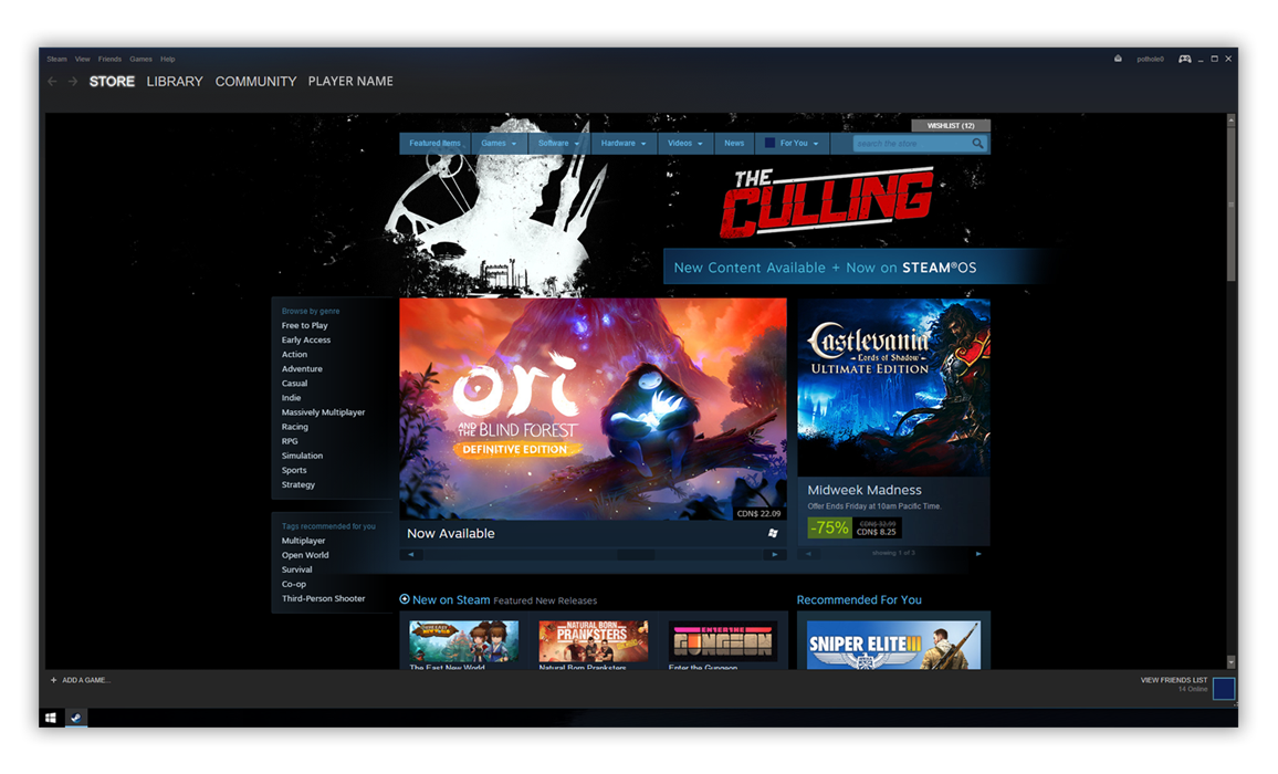
Steam, created by Valve Software, is a platform that distributes and manages games to a large community of Gamers. Gamers like to be around their own, and so Steam offers a place for people to purchase, trade, and play games. At the time, Steam was just a platform that managed and sold games. Their attempt to connect other Gamers through a "Community" page was slapped on and frustrating to use.
We, a team of five Gamers, felt that almost everything that Valve did for Steam was very well done. Except for the Community page. It was hard to use, left no notifications when a message was left on the player profile wall, and made the players felt disconnected when joining custom groups/clans. We aimed to fix this portion of Steam as we felt that connecting with other players online was just as important as managing one's game library.
A quick look at Steam's very on wall or news feed. At the time of this project, we were heavily influenced by the success of Facebook's personal wall, and felt that this could gain traction in the gaming community. This particular mock-up looks into notifications and personal wall management.
Aside from looking into creating walls for every single gamer, we also looked at improving group management and community page. Users had severe problems navigating and managing groups through Steam when we conducted heuristic evaluations. Thus we focused primarily on improving social interactions outside of playing games.
Learning Outcomes:
The result of our design was close to a hit and miss situation. We were headed in the right direction, but ultimately failed to make a complete revamp of the community page for Steam. Without proper or any attempt at user research, our redesign might have looked into a different part of the Steam Application. Although we certainly did not ask the right questions, we were right in asking Gamers alike what their experience was with Steam and what they liked/disliked about it. This project taught me to frame the question differently so that we as designers, get pass the surface of what users want, and get to the core of what users need.


